UI/UX Design
Flight Trip Planner
Planning a drone shoot day in one flow — location, airspace/LAANC/weather status, an optional shot list, gear, and a trip-readiness summary.
Status: Exploratory concept. Moderated usability testing is written and ready to run, not yet conducted.
Open the interactive Figma prototype →
The problem
Planning a drone shoot means pulling information from a handful of disconnected places: maps and community footage for location ideas, an airspace-restriction tool, requesting LAANC authorization on-site right before takeoff, a weather service checked closer to the date, and whatever gear checklist lives in your head — that's the audited workflow, not a generic industry claim. None of these share a plan. The pilot does the integration work manually, and because that assembly is loose, uncertainty about weather and final planning readiness can remain open until close to the trip.
That's not just an inconvenience. For an infrequent pilot, a late change can put travel, preparation, or limited flight time at risk.
Design question: how might a pilot assemble a clear, revisit-able shoot plan — one that distinguishes what's confirmed, what's still unresolved, and what's a genuine blocker, instead of collapsing everything into a single "ready" or "not ready" flag?
Research
The research base is a retrospective process audit of my own most recent Orlando drone shoot — walking myself through what actually happened, in the order it happened, rather than the order I'd originally guessed at. I paired that with a short competitive scan of two relevant tools (Air Aware for airspace/LAANC, and DJI Fly's community/POI experience).
Evidence used: one retrospective self-audit of my own Orlando shoot, a narrow comparison of Air Aware and DJI Fly's community/POI experience, and a later heuristic/design-QA review. No participant usability findings are included — that testing is written and ready to run, not yet conducted (see Outcome, below).
This is exploratory research based on one firsthand workflow, paired with a narrow scan of two related tools — not a study, and not representative participant research. The resulting proto-persona (a time-scarce, goal-directed hobbyist who flies infrequently enough that every flight has to earn its planning time) is a working hypothesis, not a validated finding across recreational pilots.
What the audit found: locations get shortlisted from maps and other pilots' footage, never scouted in person; there's no step for planning specific shots ahead of time; and weather can't be meaningfully checked until close to the trip, so a "planned" trip can still have an open go/no-go question hanging over it. The competitive scan reinforced the gap — Air Aware supports airspace/restriction review and LAANC, while weather, shot planning, gear, and persistent trip planning remain outside that experience; DJI's community tools are inspiration, not planning.
Scope
The flow covers planning a single new shoot day, start to finish:
Create Trip → Location → Airspace, LAANC & Weather check → Shot List (optional) → Gear Checklist → Trip Summary
Deliberately out: discovering new locations/community sharing, and post-trip retrospectives — both real needs, both separate flows from "plan a trip I already know I want to take." Parked for a later phase rather than folded in and diluting this one.
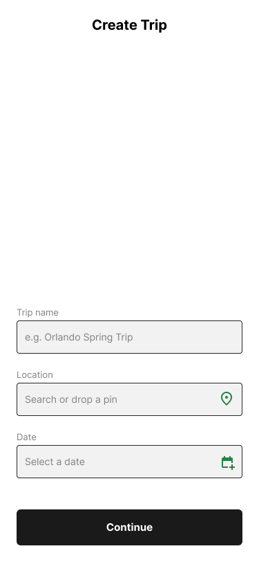
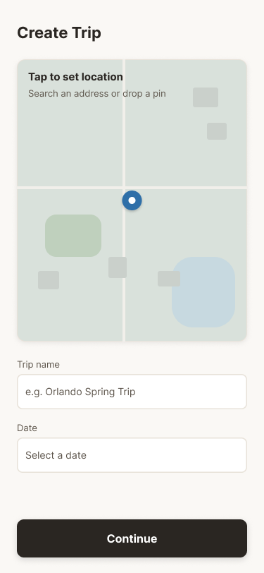
One small scope call worth naming: the first pass had a separate "Location" text field on the Create Trip screen alongside a map. It was redundant — the map already resolves to an address once you tap it — so it came out, and the map became the single way to set a location.
Three decisions, with evidence
1. Airspace, LAANC, and weather resolve independently
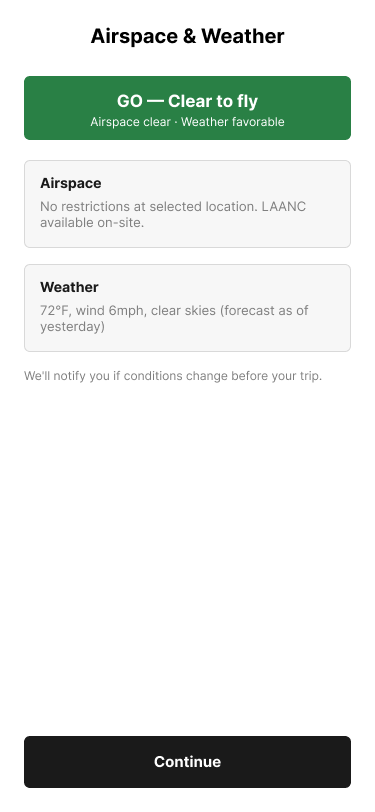
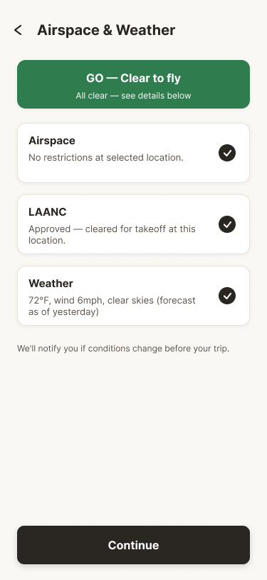
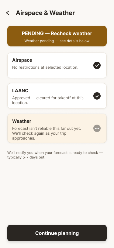
The single most important interaction-design call in this project: don't collapse three different kinds of status into one flag. Airspace restrictions, LAANC authorization, and weather each have different failure modes and different timelines — the design model treats LAANC as a near-real-time check, weather often can't be confirmed until close to the trip, and airspace restrictions are effectively static. Treating them as one combined "ready" state would hide exactly the distinction a pilot needs: is this actually blocked, or just not confirmable yet?
The earliest version didn't make this distinction — LAANC was a line of body text inside a general Airspace card. The revised version gives LAANC its own card with its own independent confirmation.
Prototype boundary: the weather, airspace, and LAANC states shown here (and throughout the rest of this page) are simulated demonstrations of the interaction model. "GO" and "DENIED" do not represent official authorization, current conditions, or a safety determination.
2. Pending, Denied, and Failed are three different situations, not three degrees of "not ready"
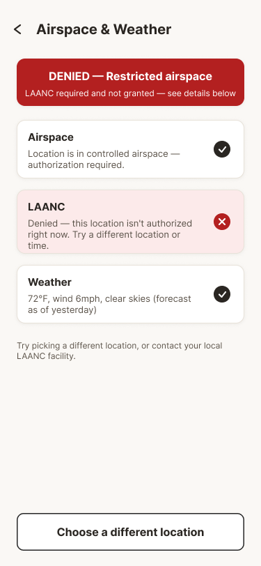
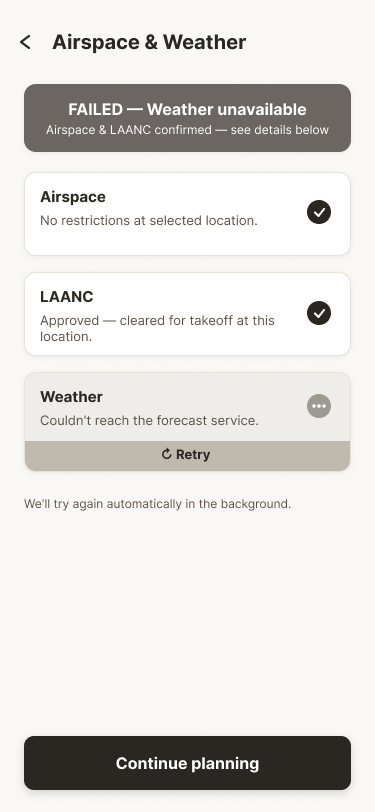
A weather forecast that's too far out to trust isn't a problem — it's unresolved, and should read that way. In the prototype's modeled Denied state, LAANC is treated as a blocker with no path forward except choosing a different location. And a weather service that can't be reached is a technical failure, not a regulatory one — the model gives it a distinct neutral treatment and an obvious recovery action, Retry, instead of reusing either the amber "still resolving" or red "hard stop" language for a problem that's neither. Flattening these into one generic "not ready" state would ask the pilot to guess which situation they're actually in.
3. A plan can go stale — and the app has to say so, not just show a contradiction
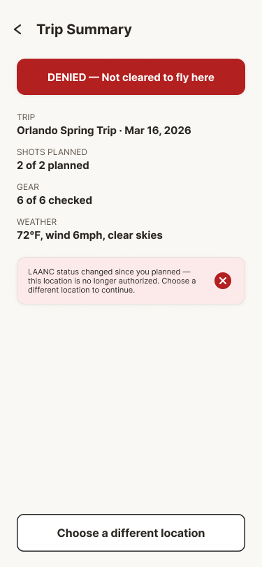
The strongest single fix in this project came from a critique pass, not the original design pass. Airspace & Weather (Denied) is a hard dead end — no way to continue, only "choose a different location." But Trip Summary (Blocked) shows a trip with shots and gear already fully planned, which looks like the pilot somehow continued past a hard stop. That looked like a broken state machine.
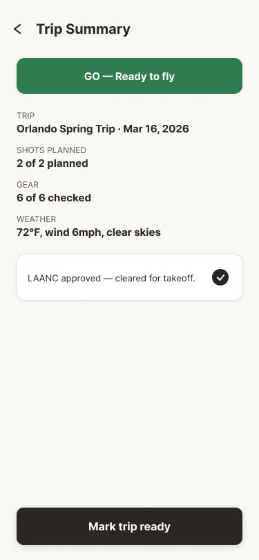
It wasn't. The design model treats LAANC as resolving close to real-time — a rule the system already applied elsewhere — so a trip that was Go or Pending when first planned can have its modeled LAANC status change by the time the pilot comes back to check it before departure. The screens already supported this structurally (Trip Summary always shows current status); the copy just didn't say so. Changing one line — from "LAANC denied" to "LAANC status changed since you planned" — turned an apparent contradiction into an honest, intentional state, without touching the flow at all.
Outcome and what's still unknown
A longer note on the screens throughout this page: the weather, airspace, and LAANC responses shown are simulated for demonstrating the interaction model — there's no live data source behind them. No screen on this page should be read as an official flight authorization or a safety determination, including the "GO" and "Approved"/"cleared for takeoff" screens above.
This phase produced a 14-frame, high-fidelity interactive Figma prototype covering the full flow plus every status state — Go, Pending, Denied, and Weather Failed for Airspace & Weather; Go, Pending, and Blocked for Trip Summary; plus recovery paths for no search results and a checking-in-progress state. The prototype demonstrates the intended information architecture, status model, and recovery paths. It does not demonstrate that a first-time user understands those states or can complete the flow efficiently — that's a different kind of evidence, and this project doesn't have it yet.
What exists as validation so far is a heuristic/design-QA critique pass (an August 2026 pass using Impeccable), which caught real logic gaps like the one above. That's useful, but it's not the same thing as watching someone unfamiliar with the project use it. A written test plan (3–5 participants, prioritizing recreational pilots, covering the happy path, status comprehension, recovery, and one-handed reachability) is ready to run — moderated usability testing is the explicit next step, not something this write-up is claiming already happened.
If I continued this project: run that testing before making any comprehension or task-success claims, then prioritize fixes by what participants actually got wrong, not by what looks most polished. A working app with live airspace/weather/LAANC data would be a separate project entirely, requiring domain and regulatory validation this prototype doesn't attempt.