UI/UX Design
ZZZ Disc Drive Calculator
A live build planner for Zenless Zone Zero — compare your own Disc Drives against your own build and see which are worth keeping.
Progress
Status: Live product, in a friends-testing phase. The first-time/onboarding flow has had a structured audit and redesign; the deeper screens (manual build, optimizer panels) have not yet.
The problem
Zenless Zone Zero's gear system (Disc Drives) rolls random substats onto every drop, the same way most gacha/ARPG loot systems do. The game itself gives you no way to tell whether a given disc is actually good for a specific character's build, or just a middling roll cluttering your inventory. Existing community tools didn't close that gap either — you could look up general stat priorities, but not pull up a comparison of your own discs against your own build and see what each one is actually worth. I built this as a passion project to solve that for myself and for other players with the same need: import or hand-enter a real build, and see which discs are worth keeping and which substats are worth farming toward next.
What it is
A live, deployed build planner and damage calculator for Zenless Zone Zero: it computes standard, Attribute Anomaly, and Sheer damage from verified formulas (cross-checked against zenless-optimizer, an existing open-source reference), and runs a substat optimizer over a player's actual Disc Drive inventory to find the highest-value upgrade path. It's built with Next.js and deployed on AWS (S3 + CloudFront + two Lambdas), with all build and save data kept in the browser — no accounts.
It's currently in a friends-testing phase: used by me and a small group of close friends with the same build-evaluation need, not a public release.
My role
This project splits into two kinds of work, and it's worth being precise about which is which:
Formula and data accuracy — my primary focus so far. Verifying the damage formulas against the game's actual mechanics and an existing open-source reference, keeping the underlying game data current as new characters and items release, and catching real errors in community-sourced formulas along the way. This is domain work, distinct from the UX process below.
UX — two separate passes, at two different levels of rigor:
- A direct pass I made myself: compacting the calculator's most-used section so the primary workflow doesn't require as much scrolling — a straightforward information-density fix for the people already using the tool regularly.
- A structured audit-and-redesign of the first-time/onboarding flow, which I directed the same way I've directed the copy on my other projects: setting the goal, reviewing the evidence, and approving each fix. I made the calls; I wasn't hand-writing the implementation.
The onboarding audit — what it found and fixed
Before any redesign work started, I had the first-time flow scored against a 10-point heuristic framework (a Dieter Rams-style "good design" rubric), which produced a baseline of 18/30. The lowest scores were concrete, not vibes:
- Understandable (1/3): UID import, locked snapshots, Manual Build, and Team View were all presented with no first-use explanation — using any of them required already knowing the product or the game.
- As little design as possible (1/3): the homepage was sparse, but both entry paths dropped straight into dense, all-at-once forms with no progressive disclosure.
- Environmentally friendly (1/3): the empty homepage was shipping the entire normalized game catalog — about 798 KB of JS and 2.33 MB of HTML — before a user had done anything.
- Aesthetic (1/3): one real responsive failure — the primary mobile control row overflowed at common phone widths.
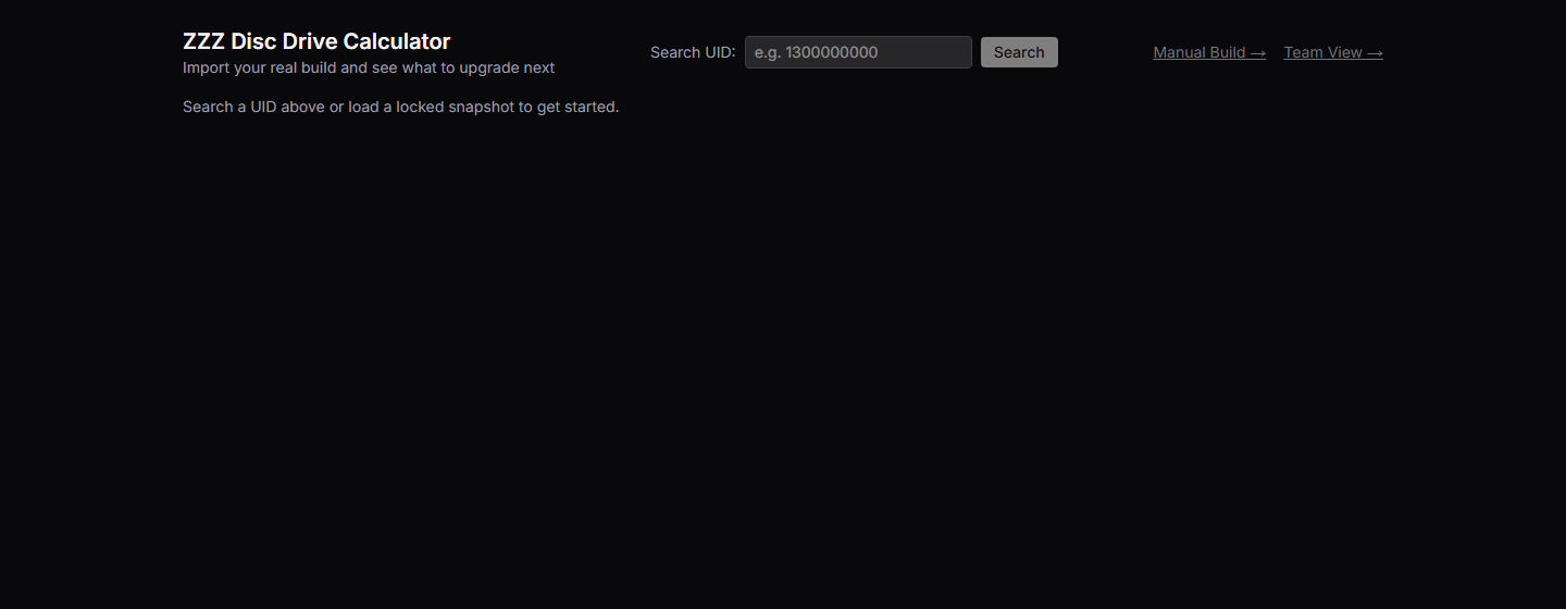
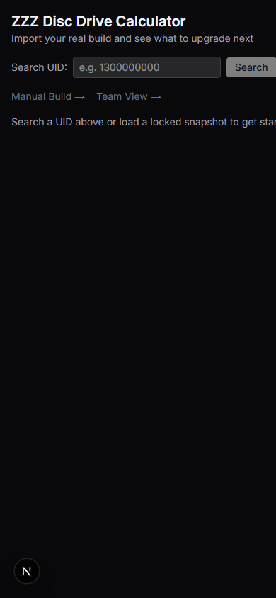
I scoped the redesign narrowly and deliberately: the calculation engine, the optimizer's exact behavior, and the expert/manual routes were explicitly preserved, not touched. What changed was the entry experience — a task-led three-path start ("Import my account" — recommended, "Enter a build manually," "Plan a team") replacing undifferentiated controls, progressive disclosure so a new user reaches a first recommendation before ever seeing Advanced settings, and fixes to the mobile overflow, missing form labels, and contrast issues the audit caught.
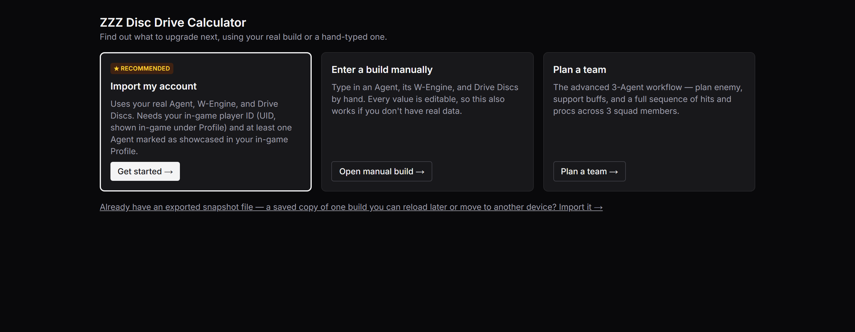
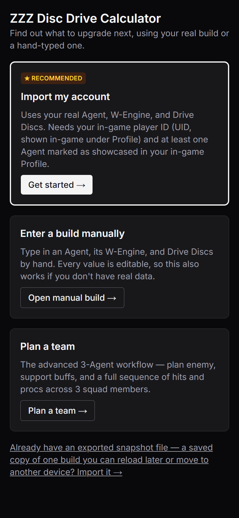
Every cutover criterion was independently re-verified before this shipped: no horizontal overflow at 320–1440px, a new user reaches a first recommendation without opening Advanced, no hidden default assumptions, saved-data compatibility preserved, and the JS payload target met (with one explicitly approved exception, documented rather than quietly accepted). This is live now — it's what a first-time visitor sees today.
What's honestly still unfinished
This project has not had a full UX/UI heuristic pass — the onboarding audit above was scoped specifically to the first-time flow, not the whole product. My own assessment of what's still rough: confusing flow, unclear labels, and information architecture/hierarchy in the deeper parts of the tool (the manual build form, the disc/substat optimizer panels) haven't had the same structured review the onboarding flow got. The dense stat-entry forms are functional but not yet evaluated the same way.
This case study isn't claiming a finished, polished product. It's evidence of shipping something real, directing a rigorous audit-to-fix process with measurable before/after criteria, and being honest about the boundary between what's been reviewed and what hasn't.
Next Steps
- Run a full UX/UI heuristic pass on the manual-build and optimizer screens, using the same scored method as the onboarding audit.
- Continue the friends-testing feedback loop before considering any wider release.